Difference between revisions of "Creating an Annotated Image Activity"
Tags: Reverted Visual edit |
|||
| (21 intermediate revisions by the same user not shown) | |||
| Line 1: | Line 1: | ||
{{DocumentationPage}}{{NeedsDemonstration}} | |||
== Overview == | |||
The Annotated Image activity type can provide additional context to an image through the inclusion of ‘Look Closer’ buttons. Each ‘Look Closer’ button can display open to display rich text, an image gallery, or a video. | |||
{{See|Annotated Image (activity type)}} | |||
== Creating the Activity == | |||
We have provided a template for the configuration file, which is used by the CLIO interface to set up the activity. We also include a content drafting template created in Microsoft Word that can aid collaboration when creating activities as part of a development team. | |||
===Define the Activity=== | |||
All CLIO activities, regardless of their Activity Type, contain many of the same configuration settings. These are used to configure the screen and load the correct content. By defining this information, we can begin to draft more specific activity content. This information is included in both the drafting template and the coding template provided with each activity type. These are the most common settings: | |||
{| class="wikitable" | |||
!Setting | |||
!Description | |||
|- | |||
|Title | |||
|The name for the activity. | |||
|- | |||
|Description | |||
|The description for the activity shown to visitors. | |||
|- | |||
|Preview | |||
|The image displayed for the activity in Exhibit Mode. | |||
|- | |||
|Introduction Video | |||
|The video displayed under the Activity Menu to provide a video introduction to the activity. | |||
|- | |||
|Audience | |||
|Each Program can have custom audiences groups, which are included as a way to help sort activities for predefined demographics. When setting up the kiosk as part of their pop-up exhibit, facilitators have the power to configure which activities they think would best fit their audience and what they’re trying to achieve.{{See|Defining CLIO Audiences}} | |||
|- | |||
|Theme | |||
|Each Activity can have a configured theme that allows each activity's aesthetic to vary slightly from the primary interface.{{See|Creating CLIO Activity Themes}} | |||
|- | |||
|Attributions | |||
| Notifications for copyrighted content used within the activity. | |||
|- | |||
|Acknowledgements | |||
| Notifications of appreciation for content creators. | |||
|}{{See|Defining a CLIO Activity}} | |||
=== Drafting the Content === | === Drafting the Content === | ||
{{Drafting Template|Activity Type=Annotated Image|URL=https://cliomuseums.org/clio/templates/drafting/Annotated%20Image.docx}} | |||
Open the provided Content Template for drafting the Annotated Image activity. First, we must decide on the basic descriptive information for the activity, such as the title, description, preview image and theme. This information is required because it is used by the CLIO interface to properly display the activity. | Open the provided Content Template for drafting the Annotated Image activity. First, we must decide on the basic descriptive information for the activity, such as the title, description, preview image and theme. This information is required because it is used by the CLIO interface to properly display the activity. | ||
| Line 15: | Line 53: | ||
Each Look Closer button can be configured to appear at a different place on the image, so we will need to choose “x” and “y” coordinates for each button. This position, measured in pixels, is stored as (x,y) coordinates relative to the top left corner of the screen (0,0). Example: entering (100,100) will move the Look Closer button right and down by 100 pixels. If you have the “fixed” option set to false, you can also set the radius of each button. | Each Look Closer button can be configured to appear at a different place on the image, so we will need to choose “x” and “y” coordinates for each button. This position, measured in pixels, is stored as (x,y) coordinates relative to the top left corner of the screen (0,0). Example: entering (100,100) will move the Look Closer button right and down by 100 pixels. If you have the “fixed” option set to false, you can also set the radius of each button. | ||
=== Options | === Coding the Activity === | ||
{{Coding Template|Download URL=https://cliomuseums.org/clio/templates/content/annotated_image.json|Edit URL=https://cliomuseums.org/jsoneditor/?file=https://cliomuseums.org/clio/templates/content/annotated_image.json}} | |||
The next step will be to take the content that was created in the Content template and begin to migrate it into the Configuration template. We will need to open the provided Configuration Template for drafting the Annotated Image activity. This can be done in a plain text editor, but for the purpose of this manual we will be using jsoneditoronline.org/. | |||
This is how the configuration file will appear once opened within JSONEditorOnline. Our first step will be duplicating the necessary fields to ensure that we can enter all of the data that we’ve spent time drafting. In our previous example, we decided to use one Look Closer button within our activity, so we should start by making sure we have one Look Closer buttons within the configuration file. | |||
Within this configuration file, the first Look Closer button within the activity is labeled as ‘1’, underneath the Tooltips object. You’ll notice that there is also a second tooltip already, titled ‘2’. For this activity, we don’t need it and can remove it by clicking the small box beside ‘2’. From there, we can select ‘Remove’ to delete it. | |||
Now, we start to copy over the information we drafted earlier and provide more information to the interface about the activity we’re creating. Using JSONEditorOnline, we can simply click on the values to edit them. Copying text from your drafting template, you can paste it into the appropriate fields. Let’s start with the configuration information, for our image and our Look Closer buttons. | |||
First, we can configure the image we would like to use for the activity. If we want to display informational placards about each image, we can also enter the “Header” and “Description”. Based on how we want to utilize the activity type, we can also set our “References Configuration”, which is used for changing how we want to display the Look Closer buttons. | |||
Now that we’ve configured our image and decided how we want to display our Look Closer buttons, our final step will be adding them to the activity. Previously, we removed the extra template tooltip to ensure that we just one for our activity. | |||
Using what we wrote in our content template, we can begin to populate these fields. Remember: position is entered in pixels, relative to (0,0), which is defined as the upper left corner. Radius will be ignored if you’re Look Closer buttons are configured to be “fixed”. We also need to define a custom icon, if we want one, and how it should be scaled. | |||
Finally, we need to enter the images and captions that we want to use for our Look Closer pop-ups. Within our content draft, we had chosen to use two images and our configuration file already has space for two images. | |||
Once you are finished, you can download the finished JSON file by clicking ‘Save’ and then ‘Save to Disk’. This file can be copied to the Program’s @Activity folder, and the media can be copied to the Program’s @Media directory. | |||
== Options == | |||
==== Configuration ==== | ==== Configuration ==== | ||
| Line 23: | Line 81: | ||
!Description | !Description | ||
!Expected Parameters | !Expected Parameters | ||
!Examples | |||
|- | |- | ||
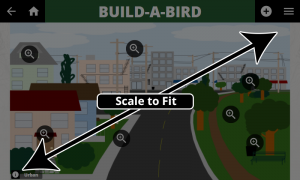
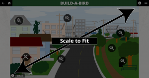
|Scale to Fit | |Scale to Fit | ||
|Should the image be scaled to fill the screen, or should it remain at its full size and be centered? | |Should the image be scaled to fill the screen, or should it remain at its full size and be centered? | ||
|True or False | |True or False | ||
|[[File:Scale to Fit - Small.png|center|300x300px|Scale to Fit - Small Screen]][[File:Scale to Fit - Large.png|center|300x300px|Scale to Fit - Large Screen]] | |||
|- | |- | ||
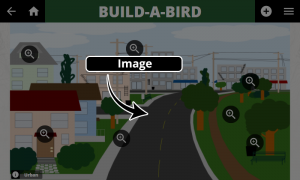
|Image | |Image | ||
|This is the image that will be annotated. | |This is the image that will be annotated. | ||
|Image File | |Image File | ||
|[[File:Image.png|center|300x300px|Image source for the background]] | |||
|- | |- | ||
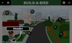
|Header | |Header | ||
|''Optional.'' This can be used to display a "name plate" in the bottom right corner. | |''Optional.'' This can be used to display a "name plate" in the bottom right corner. | ||
|Plain Text | |Plain Text | ||
|[[File:Header.png|center|300x300px|Header that is used for the "name plate".]] | |||
|- | |- | ||
|Description | |Description | ||
|''Optional.'' This is the description displayed when the Header "name plate" is touched. | |''Optional.'' This is the description displayed when the Header "name plate" is touched. | ||
|Rich Text | |Rich Text | ||
|[[File:Description.png|center|300x300px]] | |||
|- | |- | ||
|Dimensions - Height | |Dimensions - Height | ||
|The pixel height of the image to be annotated. This is used by ScaleToFit. | |The pixel height of the image to be annotated. This is used by ScaleToFit. | ||
|Unitless integer [ 0 - 9999] | |Unitless integer [ 0 - 9999] | ||
|[[File:Height.png|center|300x300px|Height of the image]] | |||
|- | |- | ||
|Dimensions - Width | |Dimensions - Width | ||
|The pixel width of the image to be annotated. This is used by ScaleToFit. | |The pixel width of the image to be annotated. This is used by ScaleToFit. | ||
|Unitless integer [ 0 - 9999] | |Unitless integer [ 0 - 9999] | ||
|[[File:Width.png|center|300x300px|Width of the image]] | |||
|} | |} | ||
| Line 55: | Line 120: | ||
!Description | !Description | ||
!Expected Parameters | !Expected Parameters | ||
! | !Examples | ||
|- | |- | ||
|Toggleable | |Toggleable | ||
|Setting this to true will enable a visibility button in the top right corner of the screen. | |Setting this to true will enable a visibility button in the top right corner of the screen. This button allows users to show and hide the Look Closer buttons, even when they are set to invisible. | ||
|True or False | |True or False | ||
| | |[[File:Toggleable.png|center|300x300px|Toggleable Option]][[File:Toggleable 2.png|center|300x300px|Toggleable]] | ||
|- | |- | ||
|Fixed | |Fixed | ||
| Line 69: | Line 132: | ||
This setting will override the “invisible” option, as well as individual radius for each Look Closer button. | This setting will override the “invisible” option, as well as individual radius for each Look Closer button. | ||
|True or False | |True or False | ||
|[[File: | |[[File:Fixed.png|center|300x300px|Fixed]] | ||
|- | |- | ||
|Invisible | |Invisible | ||
|Setting this to true will result in the Look Closer buttons being invisible. | |Setting this to true will result in the Look Closer buttons being invisible. | ||
|True or False | |True or False | ||
| | |[[File:Invisible.png|center|300x300px|Invisible Option]] | ||
|} | |} | ||
| Line 83: | Line 146: | ||
!Description | !Description | ||
!Expected Parameters | !Expected Parameters | ||
!Examples | |||
|- | |- | ||
|Title | |Title | ||
|The title that will be displayed when the user interacts with this Look Closer button. | |The title that will be displayed when the user interacts with this Look Closer button. | ||
|Plain Text | |Plain Text | ||
|[[File:Look Closer Title.png|center|300x300px|Look Closer Button Title]][[File:Look Closer Title 2.png|center|300x300px|Look Closer Button Title]] | |||
|- | |||
|Icon - Image | |||
|Select the image for this Look Closer button. | |||
|Image File | |||
|[[File:Icon Image.png|center|300x300px|Icon Image]] | |||
|- | |- | ||
|Icon - Scale | |Icon - Scale | ||
|Scale of the icon image within the Look Closer button. | |Scale of the icon image within the Look Closer button. | ||
|Integer with attached unit, e.g. 50px | |Integer with attached unit, e.g. 50px | ||
| | |[[File:Icon Scale.png|center|300x300px|Icon Image Scale]] | ||
| | |||
| | |||
|Image | |||
|- | |- | ||
|Geometry - Position - X | |Geometry - Position - X | ||
| Line 101: | Line 168: | ||
Example: entering 100 will move the Look Closer button down by 100 pixels. | Example: entering 100 will move the Look Closer button down by 100 pixels. | ||
|Unitless integer [ 0 - 9999] | |Unitless integer [ 0 - 9999] | ||
|[[File:Position X.png|center|300x300px|Look Closer button position, X coordinate]] | |||
|- | |- | ||
|Geometry - Position - Y | |Geometry - Position - Y | ||
| Line 107: | Line 175: | ||
Example: entering 100 will move the Look Closer button to the right by 100 pixels. | Example: entering 100 will move the Look Closer button to the right by 100 pixels. | ||
|Unitless integer [ 0 - 9999] | |Unitless integer [ 0 - 9999] | ||
|[[File:Button Position Y.png|center|300x300px|Look Closer button position, Y coordinate]] | |||
|- | |- | ||
|Geometry - Radius | |Geometry - Radius | ||
| Line 113: | Line 182: | ||
The Look Closer button’s center point is positioned at the (x,y) coordinates defined in the Geometry Position fields. | The Look Closer button’s center point is positioned at the (x,y) coordinates defined in the Geometry Position fields. | ||
|Unitless integer [ 0 - 9999] | |Unitless integer [ 0 - 9999] | ||
|[[File:Radius.png|center|300x300px|Look Closer Button Radius]] | |||
|- | |- | ||
|Content - Type | |Content - Type | ||
|This is the type of content that will be displayed when the Look Closer button is clicked. | |This is the type of content that will be displayed when the Look Closer button is clicked. | ||
|“Rich Text” | |“Rich Text” or “Gallery” | ||
|[[File:Rich Text.png|center|300x300px|Rich Text Look Closer Content]][[File:Look Closer Gallery.png|center|300x300px|Look Closer Image Gallery]] | |||
|- | |- | ||
|Content - Data | |Content - Data | ||
| Line 122: | Line 193: | ||
|The configuration of this field is dependent on the defined Content Type. | |The configuration of this field is dependent on the defined Content Type. | ||
{{See|Understanding the CLIO Look Closer Content System}} | {{See|Understanding the CLIO Look Closer Content System}} | ||
| | |||
|} | |} | ||
{{DocumentationNavigation}} | |||
Latest revision as of 20:35, 31 October 2022
Overview
The Annotated Image activity type can provide additional context to an image through the inclusion of ‘Look Closer’ buttons. Each ‘Look Closer’ button can display open to display rich text, an image gallery, or a video.
Creating the Activity
We have provided a template for the configuration file, which is used by the CLIO interface to set up the activity. We also include a content drafting template created in Microsoft Word that can aid collaboration when creating activities as part of a development team.
Define the Activity
All CLIO activities, regardless of their Activity Type, contain many of the same configuration settings. These are used to configure the screen and load the correct content. By defining this information, we can begin to draft more specific activity content. This information is included in both the drafting template and the coding template provided with each activity type. These are the most common settings:
| Setting | Description |
|---|---|
| Title | The name for the activity. |
| Description | The description for the activity shown to visitors. |
| Preview | The image displayed for the activity in Exhibit Mode. |
| Introduction Video | The video displayed under the Activity Menu to provide a video introduction to the activity. |
| Audience | Each Program can have custom audiences groups, which are included as a way to help sort activities for predefined demographics. When setting up the kiosk as part of their pop-up exhibit, facilitators have the power to configure which activities they think would best fit their audience and what they’re trying to achieve. |
| Theme | Each Activity can have a configured theme that allows each activity's aesthetic to vary slightly from the primary interface. |
| Attributions | Notifications for copyrighted content used within the activity. |
| Acknowledgements | Notifications of appreciation for content creators. |
Drafting the Content
Open the provided Content Template for drafting the Annotated Image activity. First, we must decide on the basic descriptive information for the activity, such as the title, description, preview image and theme. This information is required because it is used by the CLIO interface to properly display the activity.
Next, we can start to write the content needed for the Annotated Image activity type. This activity type displays an image and provides additional context to help inform users about areas of interest.
First, we need to decide on the image we would like to use, and how to describe it. You are required to provide a location for each image, but you are not required to provide a title or description. Entering this information will generate buttons along the bottom of the screen providing context for the image. Finally, we should decide whether or not we want this image to scale with the window, or remain centered.
Once we have the images decided, we can begin to work on the Look Closer buttons. To help visualize the activity, it may be helpful to mark whether you are going to use fixed or invisible Look Closer buttons, or whether we want users to be able to hide them. For each button we wish to add, we will need to duplicate the template to add additional buttons. For this example, we’ll only need one Look Closer button.
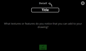
Now that we’ve duplicated the template, we can begin filling in the missing data. We will need a title for the Look Closer button, that is displayed within the pop-up window, as well as the gallery content we’d like to display when the button is clicked. Additionally, we can choose which icon to use and how to scale it within the button.
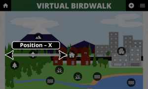
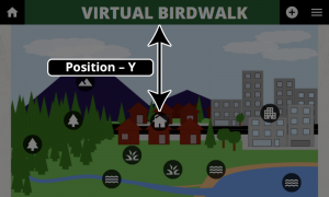
Each Look Closer button can be configured to appear at a different place on the image, so we will need to choose “x” and “y” coordinates for each button. This position, measured in pixels, is stored as (x,y) coordinates relative to the top left corner of the screen (0,0). Example: entering (100,100) will move the Look Closer button right and down by 100 pixels. If you have the “fixed” option set to false, you can also set the radius of each button.
Coding the Activity
The next step will be to take the content that was created in the Content template and begin to migrate it into the Configuration template. We will need to open the provided Configuration Template for drafting the Annotated Image activity. This can be done in a plain text editor, but for the purpose of this manual we will be using jsoneditoronline.org/.
This is how the configuration file will appear once opened within JSONEditorOnline. Our first step will be duplicating the necessary fields to ensure that we can enter all of the data that we’ve spent time drafting. In our previous example, we decided to use one Look Closer button within our activity, so we should start by making sure we have one Look Closer buttons within the configuration file.
Within this configuration file, the first Look Closer button within the activity is labeled as ‘1’, underneath the Tooltips object. You’ll notice that there is also a second tooltip already, titled ‘2’. For this activity, we don’t need it and can remove it by clicking the small box beside ‘2’. From there, we can select ‘Remove’ to delete it.
Now, we start to copy over the information we drafted earlier and provide more information to the interface about the activity we’re creating. Using JSONEditorOnline, we can simply click on the values to edit them. Copying text from your drafting template, you can paste it into the appropriate fields. Let’s start with the configuration information, for our image and our Look Closer buttons.
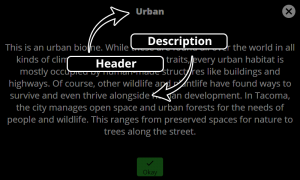
First, we can configure the image we would like to use for the activity. If we want to display informational placards about each image, we can also enter the “Header” and “Description”. Based on how we want to utilize the activity type, we can also set our “References Configuration”, which is used for changing how we want to display the Look Closer buttons.
Now that we’ve configured our image and decided how we want to display our Look Closer buttons, our final step will be adding them to the activity. Previously, we removed the extra template tooltip to ensure that we just one for our activity.
Using what we wrote in our content template, we can begin to populate these fields. Remember: position is entered in pixels, relative to (0,0), which is defined as the upper left corner. Radius will be ignored if you’re Look Closer buttons are configured to be “fixed”. We also need to define a custom icon, if we want one, and how it should be scaled.
Finally, we need to enter the images and captions that we want to use for our Look Closer pop-ups. Within our content draft, we had chosen to use two images and our configuration file already has space for two images.
Once you are finished, you can download the finished JSON file by clicking ‘Save’ and then ‘Save to Disk’. This file can be copied to the Program’s @Activity folder, and the media can be copied to the Program’s @Media directory.
Options
Configuration
These are configuration settings specific to this activity type.
| Property | Description | Expected Parameters | Examples |
|---|---|---|---|
| Scale to Fit | Should the image be scaled to fill the screen, or should it remain at its full size and be centered? | True or False | |
| Image | This is the image that will be annotated. | Image File | |
| Header | Optional. This can be used to display a "name plate" in the bottom right corner. | Plain Text | |
| Description | Optional. This is the description displayed when the Header "name plate" is touched. | Rich Text | |
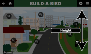
| Dimensions - Height | The pixel height of the image to be annotated. This is used by ScaleToFit. | Unitless integer [ 0 - 9999] | |
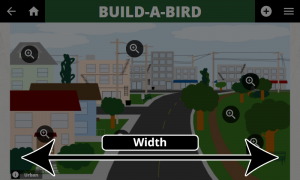
| Dimensions - Width | The pixel width of the image to be annotated. This is used by ScaleToFit. | Unitless integer [ 0 - 9999] |
Look Closer Configuration
These are settings specific to the Look Closer buttons.
| Property | Description | Expected Parameters | Examples |
|---|---|---|---|
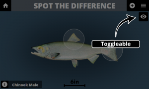
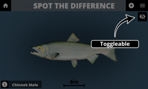
| Toggleable | Setting this to true will enable a visibility button in the top right corner of the screen. This button allows users to show and hide the Look Closer buttons, even when they are set to invisible. | True or False | |
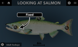
| Fixed | Setting this to true will force all Look Closer buttons to be displayed as magnifying glass icons of the same size.
This setting will override the “invisible” option, as well as individual radius for each Look Closer button. |
True or False | |
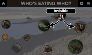
| Invisible | Setting this to true will result in the Look Closer buttons being invisible. | True or False |
Look Closer Buttons
These are configuration settings for each Look Closer button.
| Property | Description | Expected Parameters | Examples |
|---|---|---|---|
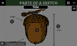
| Title | The title that will be displayed when the user interacts with this Look Closer button. | Plain Text | |
| Icon - Image | Select the image for this Look Closer button. | Image File | |
| Icon - Scale | Scale of the icon image within the Look Closer button. | Integer with attached unit, e.g. 50px | |
| Geometry - Position - X | The position, measured in pixels, is stored as (x,y) coordinates relative to the top left corner of the screen (0,0).
Example: entering 100 will move the Look Closer button down by 100 pixels. |
Unitless integer [ 0 - 9999] | |
| Geometry - Position - Y | The position, measured in pixels, is stored as (x,y) coordinates relative to the top left corner of the screen (0,0).
Example: entering 100 will move the Look Closer button to the right by 100 pixels. |
Unitless integer [ 0 - 9999] | |
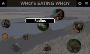
| Geometry - Radius | The radius of the Look Closer button, measured in pixels.
The Look Closer button’s center point is positioned at the (x,y) coordinates defined in the Geometry Position fields. |
Unitless integer [ 0 - 9999] | |
| Content - Type | This is the type of content that will be displayed when the Look Closer button is clicked. | “Rich Text” or “Gallery” | |
| Content - Data | This is the data that is provided to the CLIO Look Closer system. | The configuration of this field is dependent on the defined Content Type. |
| Documentation | |
|---|---|
| Installation | Look and Feel |
| Interaction Modes | Developing Activity Types |
| Creating an Interactive | Framework |
| Integrating CLIO | Contribute |
